
If you’ve been paying attention to real estate headlines lately, you’ve probably noticed they feel… confusing. One day the market is “cooling,” the next day it’s “poised for growth.” Rates dip, prices hold, inventory shifts, and homeowners and buyers alike are left wondering what it all actually means.
To cut through the noise, let’s walk through the most important market indicators provided by Christie’s and break them down in a way that’s practical, human, and useful. These charts aren’t meant to predict the future with certainty, they’re meant to give us context.
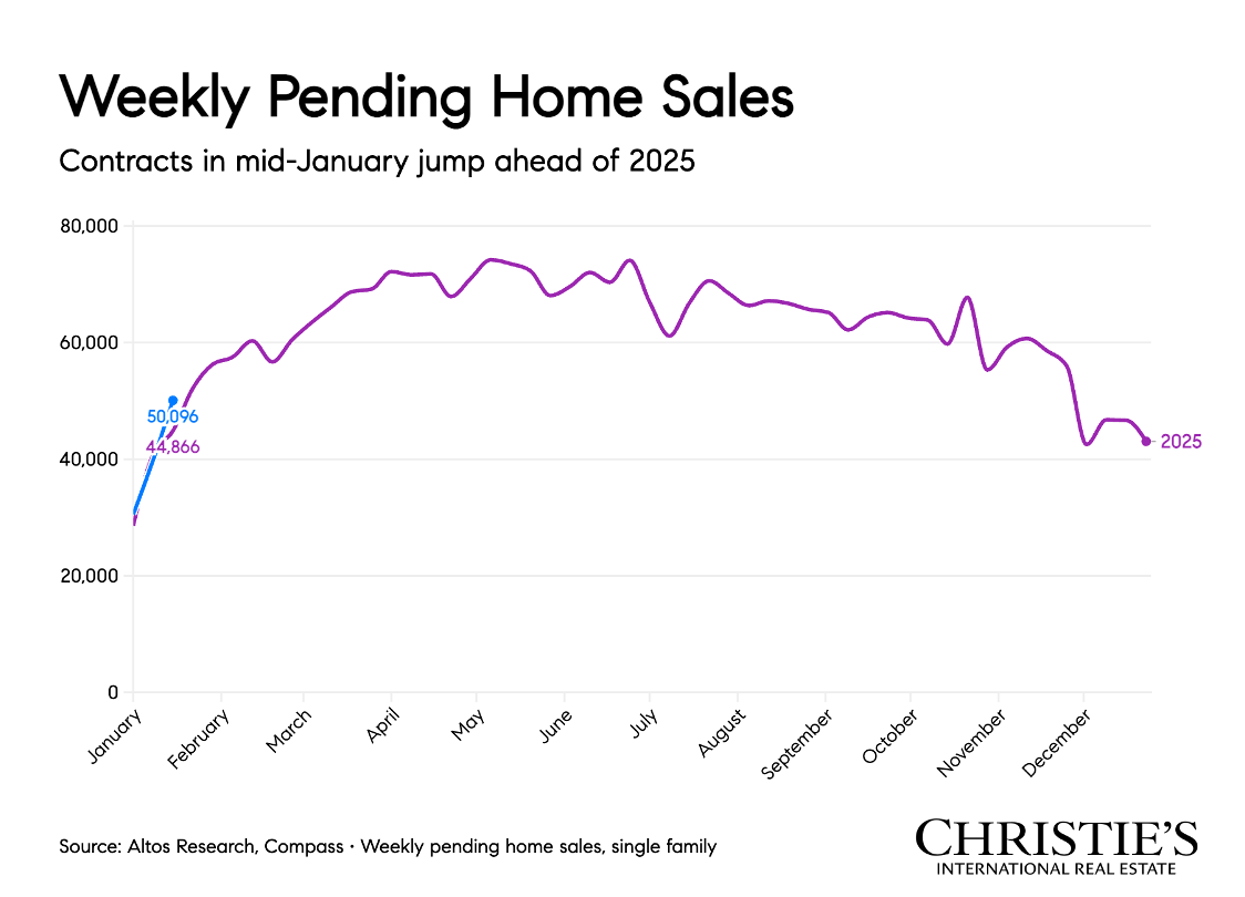
1. Weekly Pending Home Sales
Weekly pending sales track buyer activity in real time. Unlike closed sales (which reflect decisions made months ago), pending sales show what buyers are doing right now.
What it means: We’re seeing consistent buyer engagement, even during periods of economic uncertainty. While activity may fluctuate week to week, the bigger takeaway is that buyers have not stepped away from the market. Demand is still present, it’s just more thoughtful and selective.
Why this matters: This tells us that buyer confidence exists, but buyers are being strategic. Homes that are well-priced and well-presented are still moving.
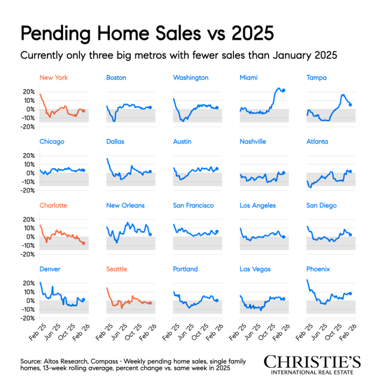
2. Pending Home Sales vs. 2025
This compares current pending sales levels to the same period in 2025, giving us a year-over-year snapshot of demand.
What it means: Pending sales are tracking closely with (and in some cases outperforming) last year’s numbers. That signals stability, not a slowdown. Buyers may be more cautious, but they’re still making decisions.
Why this matters: When pending sales hold steady year over year, it reinforces that real estate remains a long-term lifestyle and financial decision, not just a reaction to short-term rate changes.
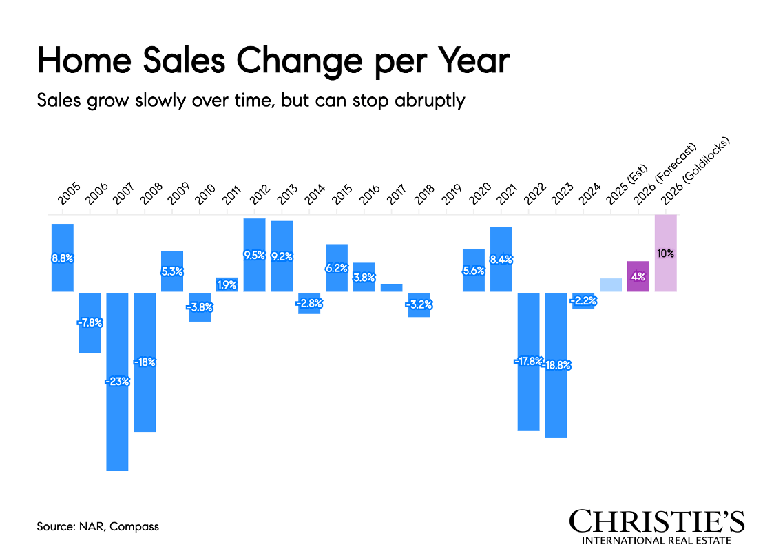
3. Home Sales Change Per Year
This looks at how total home sales volume has changed annually.
What it means: The market has normalized from the extreme highs and lows of recent years. Rather than dramatic spikes or drops, we’re seeing a gradual return to historical norms.
Why this matters: Normalization is healthy. It creates a more balanced environment where decisions are driven by life changes, not urgency or fear of missing out.
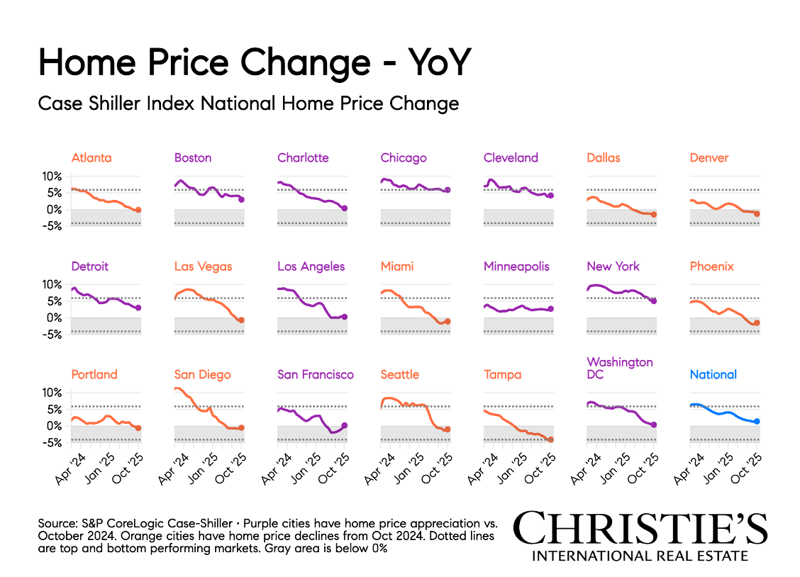
4. Home Price Change Year-Over-Year
This tracks how home prices are changing compared to the same time last year.
What it means: Prices are still increasing, but at a slower, more sustainable pace. The rapid appreciation of previous years has eased, which is exactly what economists hoped for.
Why this matters: For homeowners, this means equity is still growing. For buyers, it means less pressure and more room to negotiate, without the risk of dramatic price drops.
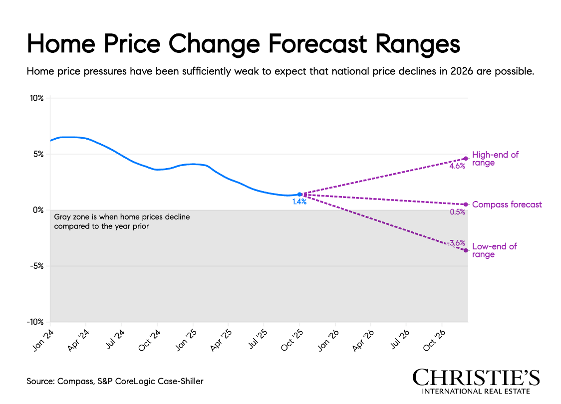
5. Home Price Change Forecast Ranges
Forecast ranges illustrate where experts believe home prices may land, accounting for best- and worst-case scenarios.
What it means: Most projections fall within a narrow band, signaling confidence in market stability rather than volatility.
Why this matters: When forecasts cluster tightly, it suggests fewer surprises. This creates a more predictable environment for both buyers and sellers planning their next move.
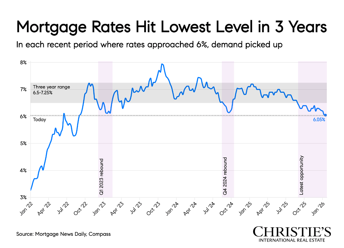
6. Mortgage Rates Hit Lowest Level in 3 Years
This highlights recent declines in mortgage rates compared to the past three years.
What it means: Rates have eased from their recent highs, offering buyers a psychological and financial boost.
Why this matters: Even small rate reductions can significantly impact monthly payments, and more importantly, buyer confidence. Historically, rate dips often unlock pent-up demand.
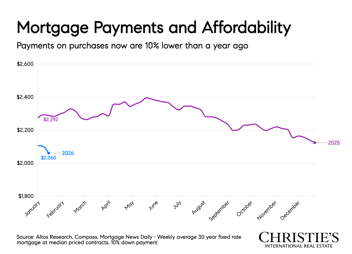
7. Mortgage Payments and Affordability
This compares monthly mortgage payments relative to income over time.
What it means: Affordability remains challenged, but it is slowly improving as rates stabilize and income growth continues.
Why this matters: Affordability isn’t just about price, it’s about payments. As this metric improves, more buyers can comfortably re-enter the market.
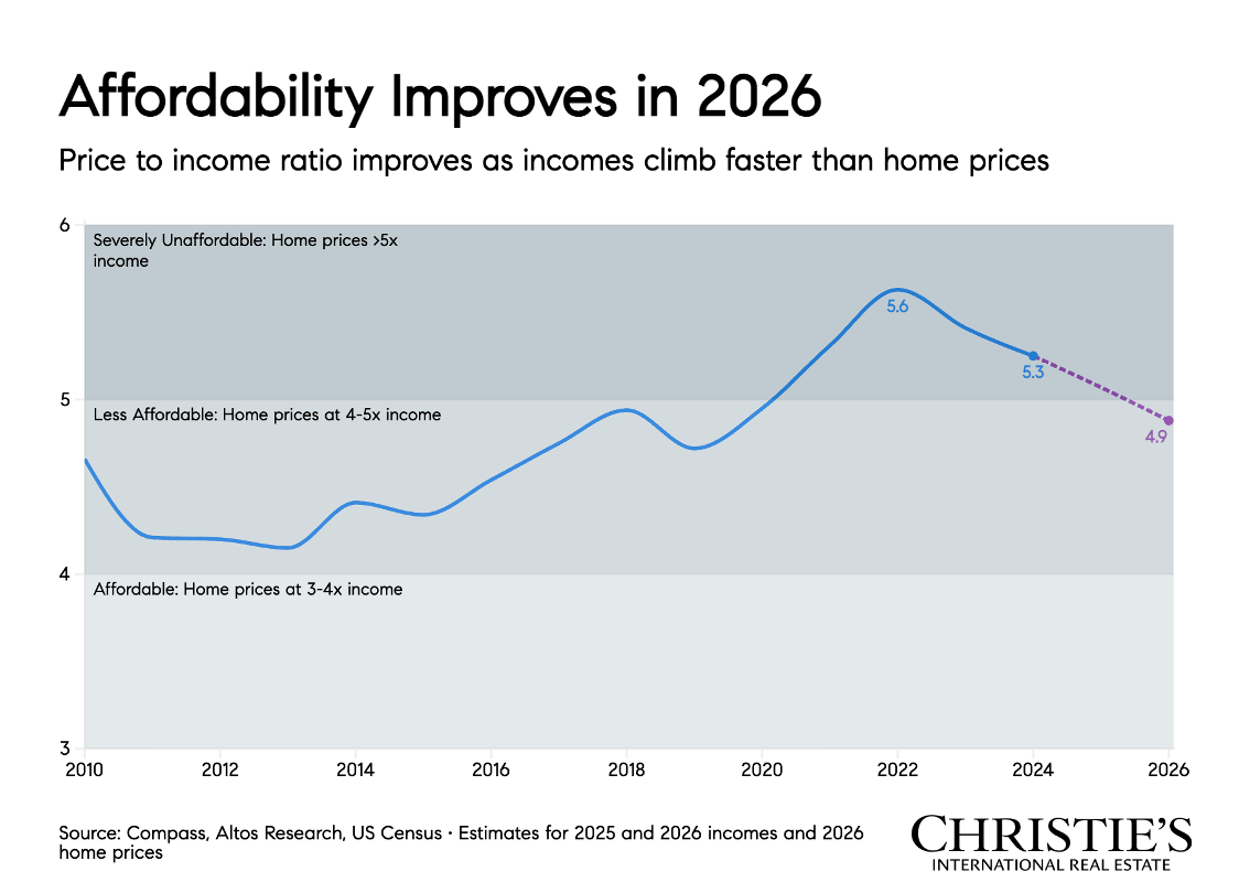
8. Affordability Improves in 2026
This projects affordability trends looking ahead to 2026.
What it means: Forecasts suggest affordability will continue to improve, driven by a combination of rate stabilization, income growth, and slower price appreciation.
Why this matters: This supports the idea that patience may be rewarded, especially for first-time buyers or those waiting for a more comfortable entry point.
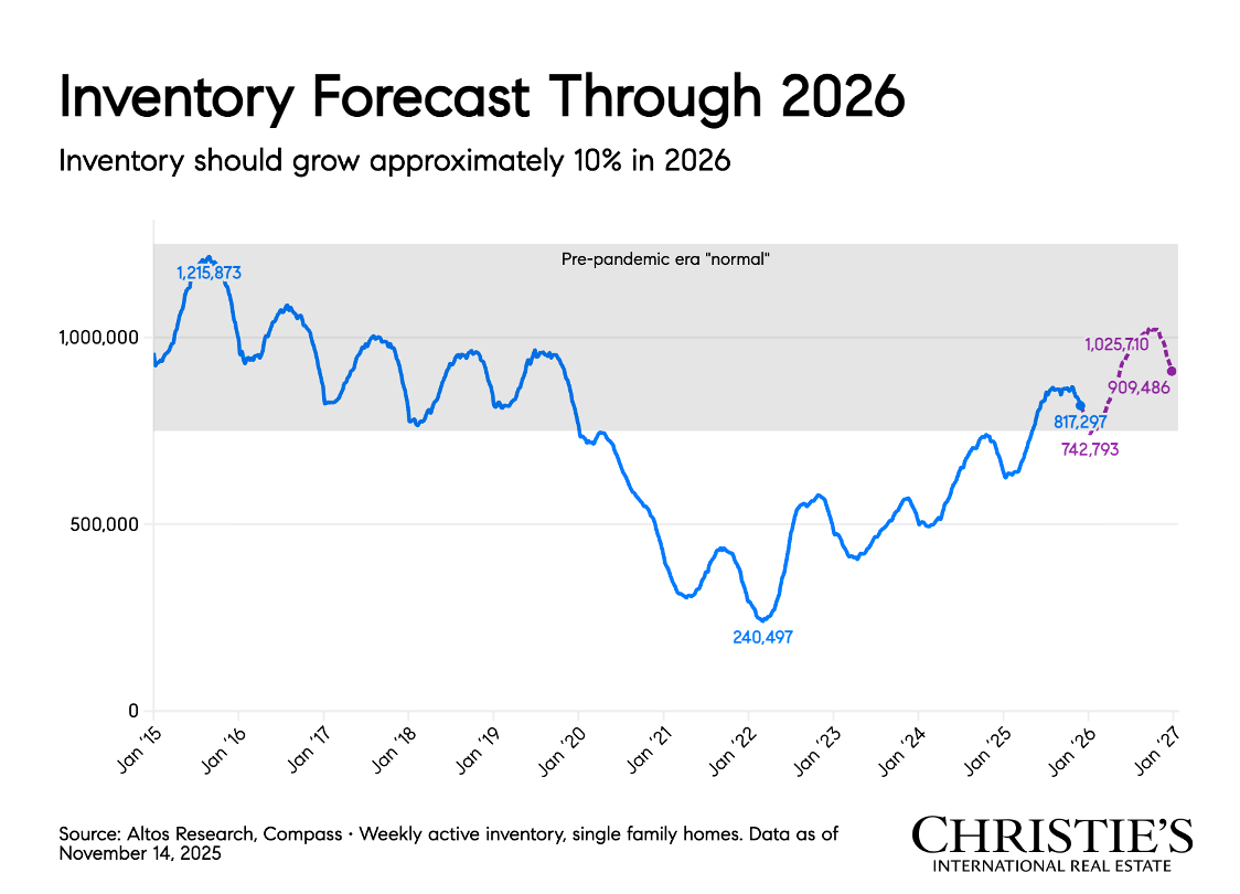
9. Inventory Forecast Through 2026
This projects housing inventory levels over the next several years.
What it means: Inventory is expected to gradually increase, but not flood the market. Supply constraints remain a defining factor.
Why this matters: More inventory means more choice, but not necessarily downward pressure on prices. Sellers will still benefit from limited supply, especially in desirable locations.
The Big Picture
When you step back and look at these graphs together, a clear theme emerges: stability.
This is not a market driven by panic or speculation. It’s a market shaped by intention, life transitions, and long-term planning. Buyers are cautious but present. Sellers are realistic but still well-positioned. And the fundamentals, demand, pricing, and inventory, remain sound.
Real estate has always been about more than charts and forecasts. It’s about timing, goals, and personal circumstances. The data simply helps us make smarter, more confident decisions. If you’re curious how these trends apply to your home, your neighborhood, or your next move, I’m always happy to talk through it, no pressure, just clarity.